How UXCG was built
This article describes the process of creating a User Experience Core Guide (UXCG) - an add-on project to UX Core, which you can explore here.
This article aims to show the project author's thought process and the stages of its creation.
For reference: UX Core is a free tool launched in the summer of 2020, which became the biggest free library of cognitive biases (thinking patterns) and nudging strategies in the world.
Disclaimer: The text in this article may be messy since it's composed of fragmented notes made throughout the development process
November 2020. The Problem:
Visitors to UX Core see many bias names, but they don't know where to start. The main feedback I've received from users so far was, "This is great, but what should I do first? Which bias to read?" etc. I need to develop a solution for UX Core that will allow visitors to use the project more substantively and efficiently.
Visitors to UX Core see many bias names, but they don't know where to start. The main feedback I've received from users so far was, "This is great, but what should I do first? Which bias to read?" etc. I need to develop a solution for UX Core that will allow visitors to use the project more substantively and efficiently.
18 December 2020. The Solution:
Develop a comprehensive Guide (further: UXCG) that enriches UX Core by mapping fundamental product management questions to cognitive biases. For every bias in UX Core, create a set of targeted questions that reveal how understanding that bias can inform product decisions. Establish cross-references between the biases and product management questions to illustrate the practical applications of cognitive bias insights across different product development stages.
Develop a comprehensive Guide (further: UXCG) that enriches UX Core by mapping fundamental product management questions to cognitive biases. For every bias in UX Core, create a set of targeted questions that reveal how understanding that bias can inform product decisions. Establish cross-references between the biases and product management questions to illustrate the practical applications of cognitive bias insights across different product development stages.
Step 0: Prepare the action plan
From the beginning, I wanted to make sure that all parts of the project were coherent. I wanted all the biases described in UX Core to have at least a few questions that they answered. The questions, in turn, needed to be general enough for the reader to extrapolate to hundreds of other situations.
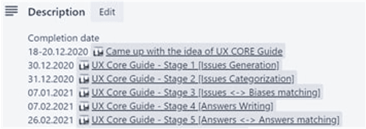
By December 20th, I prepared an action plan, which generally remained the same, although it changed in the process. All steps were written out in Trello:

Step 1: Issues generation
The first step was to write the questions that will be addressed with biases later.
One evening was spent going through all the popular Russian and American product management-related portals. I had no idea what I was looking for, but I hoped to find some "pattern" of questions. Alas, I failed. The questions people asked on Reddit, StackExchange, Quora, and other portals were too specific.
One evening was spent going through all the popular Russian and American product management-related portals. I had no idea what I was looking for, but I hoped to find some "pattern" of questions. Alas, I failed. The questions people asked on Reddit, StackExchange, Quora, and other portals were too specific.
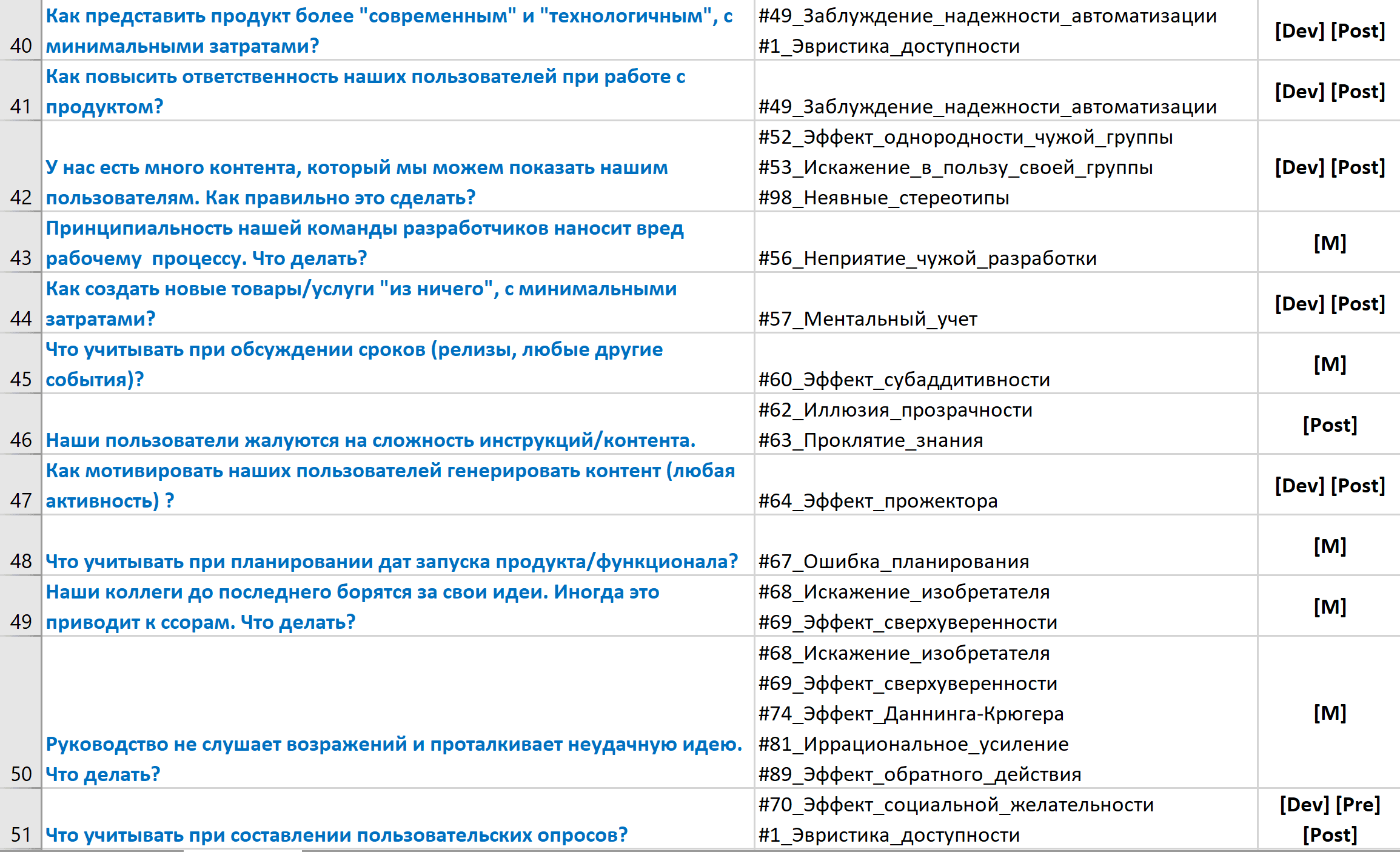
After not finding anything useful, I used the biases already described in UX Core. After going through each of them, I tried to generate at least 1 question to which this bias would be perfectly relevant. I expected over a hundred questions, but in the end, I got 80 (I was working on the Russian version first).
Columns: Question | Relevant cognitive bias | Product stage
Step 2: Merging the questions
Many questions were similar, so I merged them. Thus, 80 questions fit into 73. Later, another round of merging was held, this time because of too similar answers. In the final version, 63 questions were posted.
Step 3: Questions categorization
A UXCG visitor shouldn't have felt the same discomfort as UX Core users — seeing a lot of information but not having navigation mechanisms. So, I decided to create question labels that would allow the user to filter out the information that was most relevant to him. Having looked at the questions I had already prepared, I decided it would be most convenient to divide them into categories corresponding to the product. Thus, the following labels were created:
Tea
Tea
- Team - Questions related to in-house team members' cooperation (product, development teams, and others);
- Development - Questions related to the product development stage (from concept to first public release);
- Pre-SignUp - Questions related to sales, marketing funnels, prospects and leads communication, and overall product packaging;
- Post-SignUp - Questions related to user interaction with the actual product and its features;
- Analytics - Questions related to product analytical data analysis;
Then, I assumed that one question could fall under more than one category.
For example, the question "How can bonuses and promotions be made more attractive for users?" can belong to both the development stage and pre-sign-up/post-sign-up. We can plan bonuses and promotions at the Development stage and schedule them for potential (Pre-SignUp) or existing users (Post-SignUp).
The categorization of the questions was completed on the afternoon of December 31st. At that time, I spent about 20 hours on the project.
Step 4: UX Core biases match with UXCG questions.
The next step was mental torture for me. From December 31st, 2020, to January 8th, I consistently matched every bias from UX Core to every UXCG question.
Each morning, I would open UX Core and carefully select a cognitive bias. After thoroughly reading its description and recalling related research, I would transition to an Excel document containing UXCG questions. I meticulously worked through each question, mentally simulating scenarios and critically evaluating how the selected bias could provide meaningful insights. Whenever I determined a bias was substantively relevant, I would annotate it in the corresponding column and proceed to the next question. This comprehensive analysis was conducted across 105 × 73 potential intersections (prior to merging certain questions at a later stage).
Each morning, I would open UX Core and carefully select a cognitive bias. After thoroughly reading its description and recalling related research, I would transition to an Excel document containing UXCG questions. I meticulously worked through each question, mentally simulating scenarios and critically evaluating how the selected bias could provide meaningful insights. Whenever I determined a bias was substantively relevant, I would annotate it in the corresponding column and proceed to the next question. This comprehensive analysis was conducted across 105 × 73 potential intersections (prior to merging certain questions at a later stage).
Thus, 7,665 possible links of questions with biases were manually analyzed.
On average, it took me 45 minutes to match one bias with all the questions. The difficulty was in the extreme complexity of modeling due to the constant change of context. I could spend 3 minutes analyzing bias in two semantically similar information-related questions and then 10 minutes forgetting the previous questions and then thinking about something completely different. The hardest part of all this was keeping the focus on the task at hand. The brain was ready to do anything literally but not do what I needed.
I asked myself, "Why am I doing this?" a million times. Another complication was the fact that I did not allow myself to continue working if I felt tired. I didn't want my laziness or tiredness to affect the quality of my output in any way, so I forced myself to run to relax and get back to work. So, from mid-December to mid-January, I casually ran about 120 kilometers :-)
I asked myself, "Why am I doing this?" a million times. Another complication was the fact that I did not allow myself to continue working if I felt tired. I didn't want my laziness or tiredness to affect the quality of my output in any way, so I forced myself to run to relax and get back to work. So, from mid-December to mid-January, I casually ran about 120 kilometers :-)
By January 7, I had completed the matching, having spent 80 hours on this task and more than 100 hours on the project as a whole.
It resulted into something like this: (question | #relevant_biases)
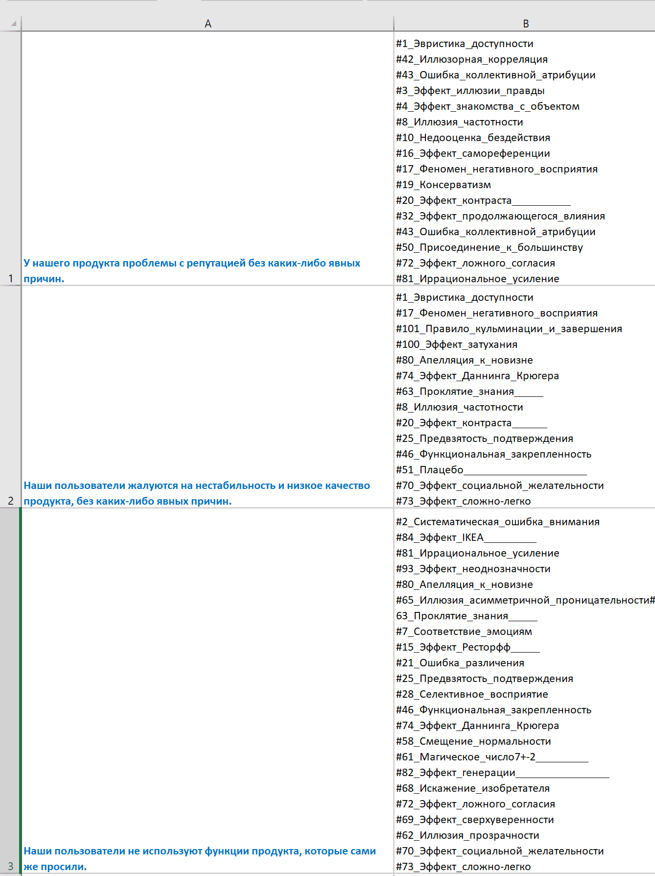
A screenshot from the main UXCG card in my Trello board:

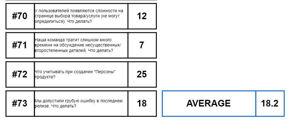
After that, it took me an hour to manually calculate the number of biases associated with each question and calculate the average number of those.
It was an exciting moment. I have never counted the number of possible viewing angles for a certain situation before. If I were asked any of the questions from UXCG and asked for a number of possible points of view (from bias perspective), I would say 3 or 4. But that evening, I got an average of 18.2.
Given that most cognitive biases are highly intuitive, this essentially means that even in simple questions like clothing choices, our brains operate with at least a dozen cognitive biases (depending on the level of our self-awareness, of course). At the same time, the number of biases taken into account by the brain increases with the amount of information that we have at our disposal.
Screenshot from calculations: (Question #ID | Question (in RU) | Associated biases number #)
Step 5: Answer writing
The next step was to write the answers and create the structure of the future UXCG pop-ups. I chose the following structure as the best fit:

Question: Question itself;
Tags: Labels indicating to which product state this question is related (e.g., Development, Pre-SignUp, Post-SignUp);
Aliases: Here, I wrote similar questions to add them to the UXCG search engine. I rephrased the same question and wrote it differently a dozen times in the Aliases section. The purpose is to allow the user to find the content of interest to him by keywords if the labels were not enough for him.
Answers: Answer options;
Related Questions: Other similar questions from the UXCG.
A separate task was to come up with the structure of the answer itself. I didn't want to write examples of use because, in that case, I would deviate from the original idea of the project. I wanted to show the answer and let the reader understand for themselves how relevant the answer is for their case. I didn’t want to show ready-made solutions either, as they are too specific for each case, and it would take a lot of text to write one correct question-answer pair.
So finally, I decided to use the basic structure "[bias]% answer%". Where [bias] I wrote the bias name from UX Core. At the same time, it had to be clickable and, by clicking in the form of a tooltip, load a description of the bias from the UX Core. The idea was not to pull the reader out of context, letting them quickly familiarize themselves with the bias and continue reading the answer.
Something like this: (#22 Framing effect. <…answer…>)

This step took one month. While working on this, I merged ten more questions by making the final number of questions 63.
I was spending on the project around 4 hours on working days and +2 extra hours on weekends.
So, by the 7th of February 2021, I finished this stage after spending 128 hours on it. (230 hours in total since the project started).
I was spending on the project around 4 hours on working days and +2 extra hours on weekends.
So, by the 7th of February 2021, I finished this stage after spending 128 hours on it. (230 hours in total since the project started).
UXCG card screenshot from my Trello board:

Step 6: “Similar Questions” section development
This had to be the last difficult stage in the project. Difficult because the nature of the task was similar to the one I did in step 4 when I linked biases with questions. Now I had to match the questions with each other in order to make the "Related Questions" section as relevant as possible to the readers.
Matching 63 questions with each other required an analysis of 3,906 possible connections. Due to the workload, moving to another country, and emotional exhaustion, I spent no more than an hour a day on this task. The idea was not to burn out, reduce the quality of work, or lose objectivity in actions. So, this task was solved in about 20 hours (250 hours in total) by February 26, 2021.
Step 7: UI-UX design
After completing the sixth step, I decided to take a rest from the project for a week. Then, after getting all my thoughts together, and fully confident in what I wanted, I asked my friend Dee (who was the one who designed UX Core one year earlier) to help me visualize the UXCG. In total, we worked for about 10 hours, of which seven were spent only to create the UXCG main page and question pop-up, and the remaining 3 to discuss and implement the UXCG <-> UX Core integration elements.
Step 8: Editing
After finishing the design, I started editing the project texts. At this point, only the Russian version was ready. Before starting the translation into English, the goal was to make it as readable as possible for the Russian audience.
This step took two weeks. Editing was carried out on Monday through Friday evenings, 3 hours a day, and was done by March 30th. At this point, I have worked on the project for 290 hours.
After editing, I re-counted the number of responses in the UXCG. This was necessary because, in the process of writing answers and editing, I removed those answers that were too difficult to understand due to the incomplete context. In fact, even now, there are answers in UXCG that are difficult to understand without context or expertise in the issue under discussion. This was the biggest dilemma for me. I removed many answers because of the professional experience threshold of the reader. However, I could not remove a number of answers, considering them too important. At the same time, I realized that many would not be able to understand them well enough.
I constantly chose between readability, the amount of information, and my desires, and in the final version, I left only 896 answers (out of about 1300, I suppose).
Step 9: English version
Due to the increased workload, I stopped recording the exact time spent on further steps. However, I kept task completion dates in Trello.
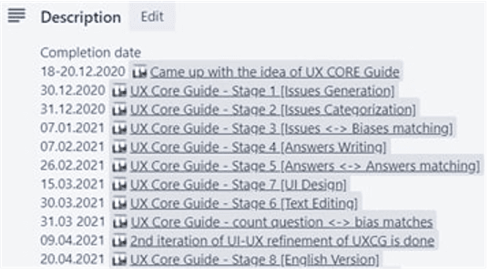
By April 20th, I had completed a rough translation of all UXCG content into English. It was imperative to return to text editing, but I needed to distract myself from the UXCG content because I could no longer keep my concentration reading this text again.
Step 10: UXCG Intro article writing
By this time, my friends had already started the project's technical implementation, and I started writing an introductory article. From the very beginning, I planned to publish the English version on Medium and the Russian version on Habr and keep a copy as archival material at Keepsimple. The introductory article was completed on May 3rd.
Step 11: English content editing
The next ten days were spent on the major editing of the English content of the UXCG, as well as the compilation of SEO materials (keywords, descriptions) for both UX Core and UXCG.
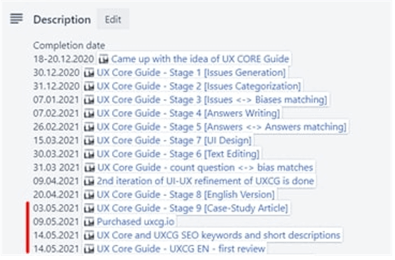
I also purchased the uxcg.io domain as I thought it might be more comfortable for the visitors in terms of link sharing (Although later, I canceled it and left only uxcore.io).
Step 12: Final editing of Russian content
I constantly wanted to make the content readability as high as possible, so I showed snippets of UXCG to different people and studied their opinions. In some cases, I would literally read a paragraph from UXCG and then ask the listener to explain to me what I had read.
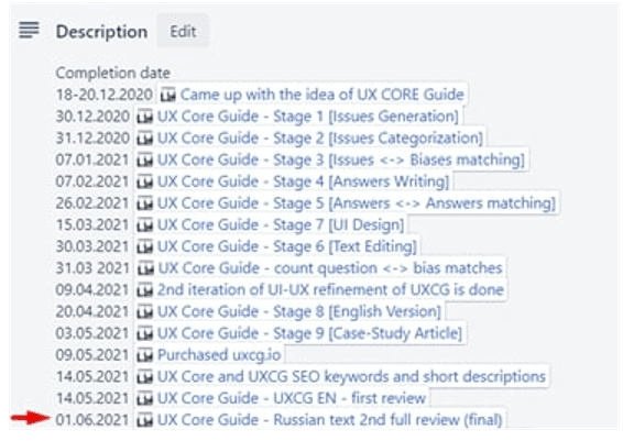
After the feedback, I decided to spend another two weeks meticulously editing the content. About 15% of the material was edited in this round, and I realized that I should do the same with the English version.
Step 13: Final editing of English content
Every free minute of the next week, including the entire weekend, was spent going through each sentence in the English version of UXCG and maximizing its readability. A good friend helped me in this matter. She managed to endure the nervousness and irritation that I experienced while rereading the same sentences that I had reread a hundred times. We managed to significantly increase the readability of English content, after which I promised myself that I would not re-read UXCG content anymore.
Step 14: UXCG Technical Implementation
By July 25, we've completed the first stage of the project's technical implementation. The admin panel was ready, and now I had to upload all the UXCG questions, aliases for their search, and all the answers. Also, I had to fill in the "similar questions" section for each question. Because I didn't want to make mistakes, I decided to avoid using scripts that automate this process. Therefore, it took me a week to manually enter all the data. The only thing we decided to automate was the "Mentioned in UX Core Guide" section on the UX Core bias pages.
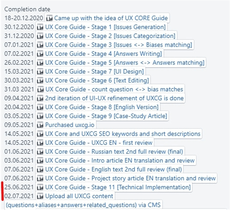
Immediately after that, we released the project and protected it with a username-password so that we could have internal testing of project usability and find bugs. We shared the password among project participants and some friends who desired to help with testing.
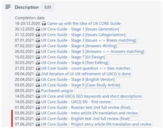
It took us nine days to fix bugs for each of the three projects (keepsimple.io, UX Core, UXCG). On July 11, after ensuring that all project pieces are coherent, we decided to configure the analytics modules (GTM + bias and question-based "usefulness" analysis). It took us two more days to do this, and by July 13, I decided to finish writing this article and prepare for the release. At the moment, while I'm writing this text, the Trello project card looks like this:
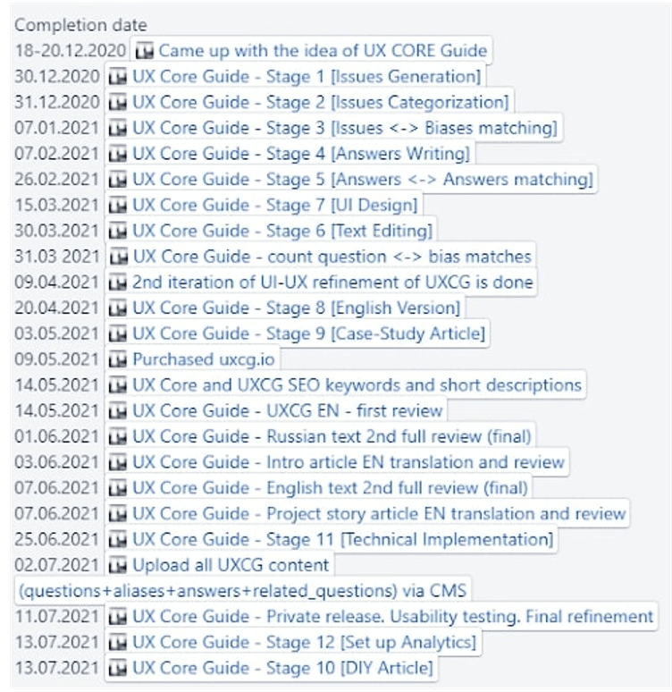
Now it is Jul 13, 2021, 10.24 pm (Abu Dhabi time). The only remaining task related to the project looks like this:

Now I will finish this article. Within an hour, I will translate it into English and ask Artem to update it to keepsimple. The project will be open to the general public on July 16th when I arrive in Yerevan. In any case, I hope that I am soberly assessing the situation and that the planning fallacy will not affect the timing. If you see a different release date in the lower left part of the UXCG page, then, with all my care and calculations, I was wrong again.
At the end of this article, I want to thank my dear friends, without whom this project's complexity would have grown tenfold. Many thanks to Vahan for emphasizing the importance of the back-end system for the project and writing it. Many thanks to Artem for once again supporting me and taking on the implementation of the front end. I appreciate your patience with which you endured my flawed irritation and whining at different stages of the project. Thanks to Karen for the excellent visualization and support simply because it was important to me (although I hope you also got into the spirit of creating a scientific project). And, of course, thanks to Lusine for helping with the editing of the texts. My close people know how painful I perceive working with text, words, and meanings. And I am grateful to you that we did not fight because of my overreaction to every word-related change in the project. Special thanks to Sargis for help with DevOps work and Narine for reminding me once again that text in a speech and a letter are two different things.
Thanks to all of you for being who you are. I hope that everyone, at some point in their life, will be able to experience the incredible pleasure of working with such professionals who have no ego problems.
I wish all of us the realization of how primitive we all humans are. No matter what we know and no matter how we behave. Regardless of our social status, wealth, and level of education, we are one big family with single documentation for all. Today these are cognitive biases, and at some point, it might be something more comprehensive, where biases will be only a small element of the general framework that describes our system.
That's all,
Wolf Alexanyan
Wolf Alexanyan

