 ru
ru

UI-UX design case study: Designing enterprise resource planning (ERP) system based on the PRD.
Author: Kristina Shanoyan
Co-author: Wolf Alexanyan
Disclaimer: The case study is based on a real, 8-digit $ cap project that was implemented from scratch. The system was completely redesigned for the sake of this case study.
Since we’re talking about a highly secure, private system that was built for a very unique customer, some of the sections of this case study won’t look like the standard ones or will be omitted completely.
Link to the PRD
Link to the Figma Prototype
Link to the Persona with mapped Cognitive biases
Link to the Persona in UX Core Persona tool
#1. Project Introduction
The Enterprise Resource Planning (ERP) system that we want to design will be used in an existing organization. It will be accessed by over three thousand employees at the start.
To name a few examples of the ERP system: MS Dynamics 365, SAP ERP, Oracle Cloud, Odoo, and many others.
Our customer's organization has a well-established set of processes and workflows that are critical to their business operations. Almost every workflow starts with submitting a different form, with the subsequent need for different position holders to review and process the request.
The nature of requests varies from a simple day-off or salary review continued with much more complex requests for business trips to different countries, training requests, etc. From the system perspective, the lower layer is a regular employee (95% of all system users) who always gets involved in different activities and has submitted/pending requests of different natures.
Then comes a middle layer - HR team members (4% of all system users). They are the ones who maintain the workflows, the requests, and the forms. The highest level - the admins (<1% of all system users) - maintain the core of the ERP - the environment in which the HR team can create different workflows and forms.
Due to the specific nature of their business, The workflows, processes, and the people responsible for them constantly change, which can have a significant impact on the organization. This highlights the urgent need for an adaptable and scalable ERP system that can help them create and modify anything as needed starting from input fields and forms and finishing with organization structure.

#2. Product Requirements Document (PRD) Review
Throughout the design process, the PRD served as the primary guiding document. A few key points mentioned in the PRD gave the base for some fundamental design decisions. The most important ones are:
1. "The system will be web-based, with the support of all modern browsers (MS Edge, Chrome, Firefox, Safari). The mobile support of the system is not considered in the MVP. This means we consider the system users to log in from desktop workstations only. The system will be used internally in an air-gapped network, meaning that there won’t be any Internet connection, and the system will have to work autonomously."
This requirement suggested that the UI/UX design should be optimized for desktop screens. Consistency must be provided through seamless user experience across all supported browsers, including Safari.
Given the organization's bureaucracy, the assumption is that some (or most) of the end-users will be using Internet Explorer / MS Edge browsers. Since the air-gapped network was mentioned, we can't be sure that the end-user will have up-to-date versions of browsers. This said we'll avoid fancy UI solutions in favor of more basic ones. In other ways, we shouldn't rely heavily on Javascript for beauty.
2. “The smallest screen size the system supports is Full HD (1920x1080).” So there will be no need for any design considerations for smaller screens.
Working on this resolution gives us colossal freedom. Given that the ERP system implies a ton of functionality, this is a huge plus.
3. “The system will be available in Arabic (default) and English”
This requirement highlighted the need for a multilingual design. The layout and typography should be adapted to support RTL (Right-To-Left). The color palette should be adjusted to look comfortable for English, as well as Arabic-native users.
4. "There are three system user types: admins, HR team members, and regular employees. Each user type has its set of privileges and accesses.”
Here we see that some of the user groups will be maintaining the system, while others will focus on the actual in-house operations of the organization. This means the UI will look different for users, depending on their access privileges. Therefore, we'll have to ensure the UI and UX we build look nice and comfortable for each user, regardless of their access.
#3. User Research
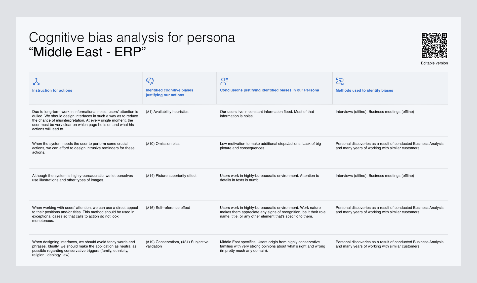
To define our User Persona, we've conducted offline and online interviews and surveys and processed dozens of meeting minutes from our product managers, who constantly met customers and end-users.
Then we laid out all hypotheses and facts about system end-users and mapped those to cognitive biases that the users are prone to the most. This gave us a clear plan of what we must consider while working on design (and not only design).
The fundamental idea behind this analysis is that cognitive biases are the roots of how people perceive information and interact with the product.
Understanding and addressing those biases in design can dramatically improve the product's usability and overall user experience. A major part of the result of the analysis can be found below:
#4. Main Challenges
While there are multiple off-the-shelf solutions presented on the market, the main challenge that our customers faced was the limited flexibility of existing solutions.
The customer wanted to have a highly-flexible system with a modular structure that would enhance each module separately from the rest.
Another major challenge was to find a way to provide simple navigation in the system so it won’t be overwhelming for users despite the extreme amount of complex, nuanced functionality and features.
#5. Information Architecture
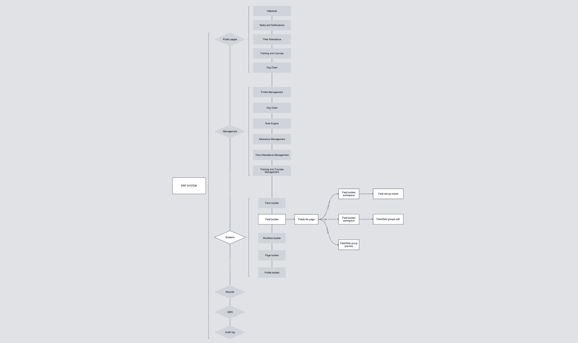
As the first step in addressing the above-mentioned challenges, we’ve decided to visualize the Information Architecture (IA) of the project. This allowed us to have a birds-eye view/big picture of the software and its main navigation mechanics.
Sitemap
#6. Wireframe design
The next step was to design wireframes. Based on our knowledge of the software used by our customers, we focus on building similar user experiences. With this approach, we stick to Jakob’s law: the tendency for users to develop an expectation of design conventions based on their cumulative experience with other websites.
MAINFRAME
The mainframe of our ERP System consists of two sections: the navigation bar and the page content area. We have decided to use a side panel from the left for the navigation bar. Such positioning allows us to be sure that the user won't "lose" in the system or won't know "how to get back".
Multiple pieces of research have shown that users tend to scan web pages in an F-shaped pattern, with the top and left-hand portions of the page receiving the most attention. Therefore, by placing the navigation panel on the left, we ensure high visibility of it for the user.
Of course, in right-to-left languages such as Arabic, the F-pattern tends to be reversed. As such, the navigation bar in the Arabic version of the design would be right-aligned accordingly.
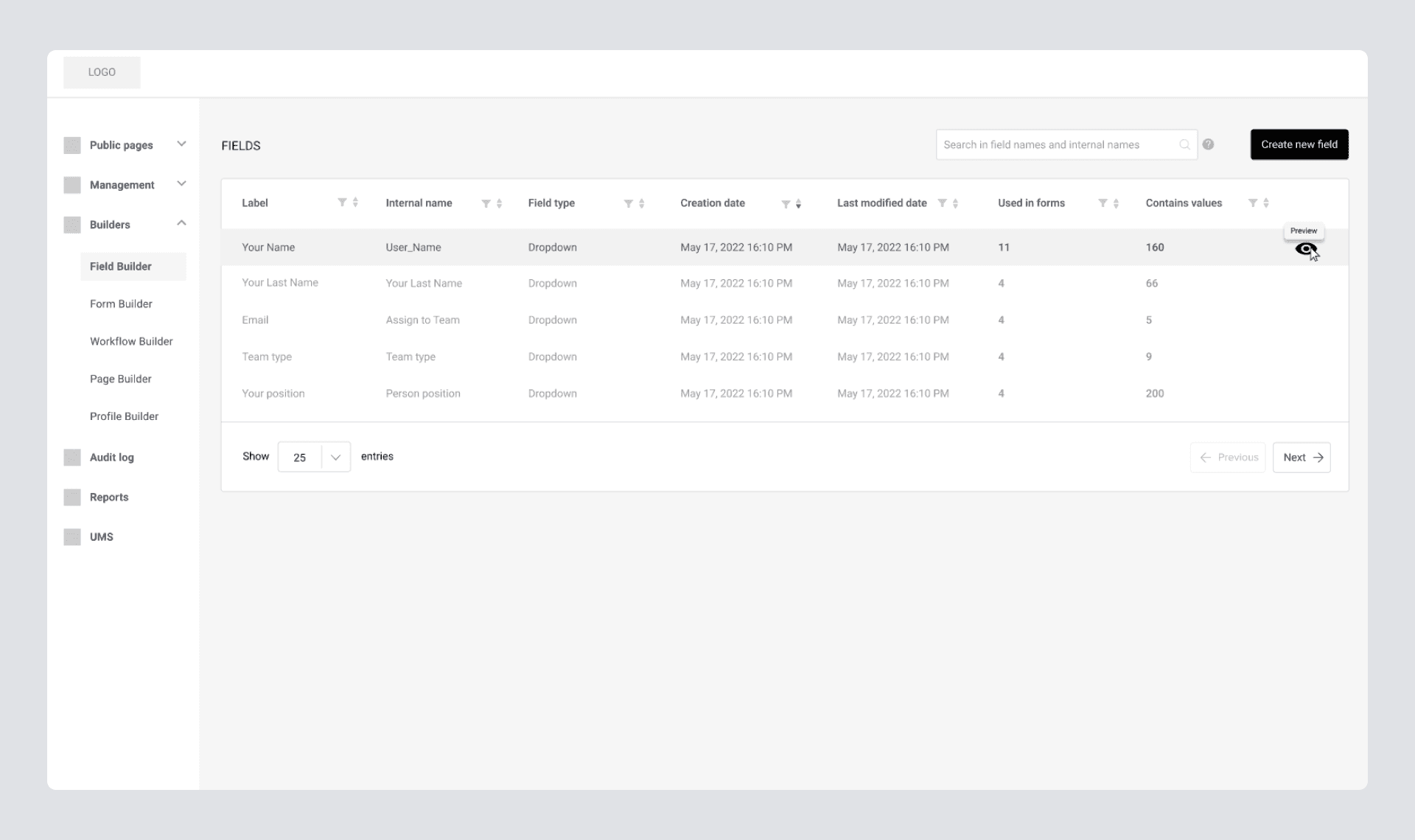
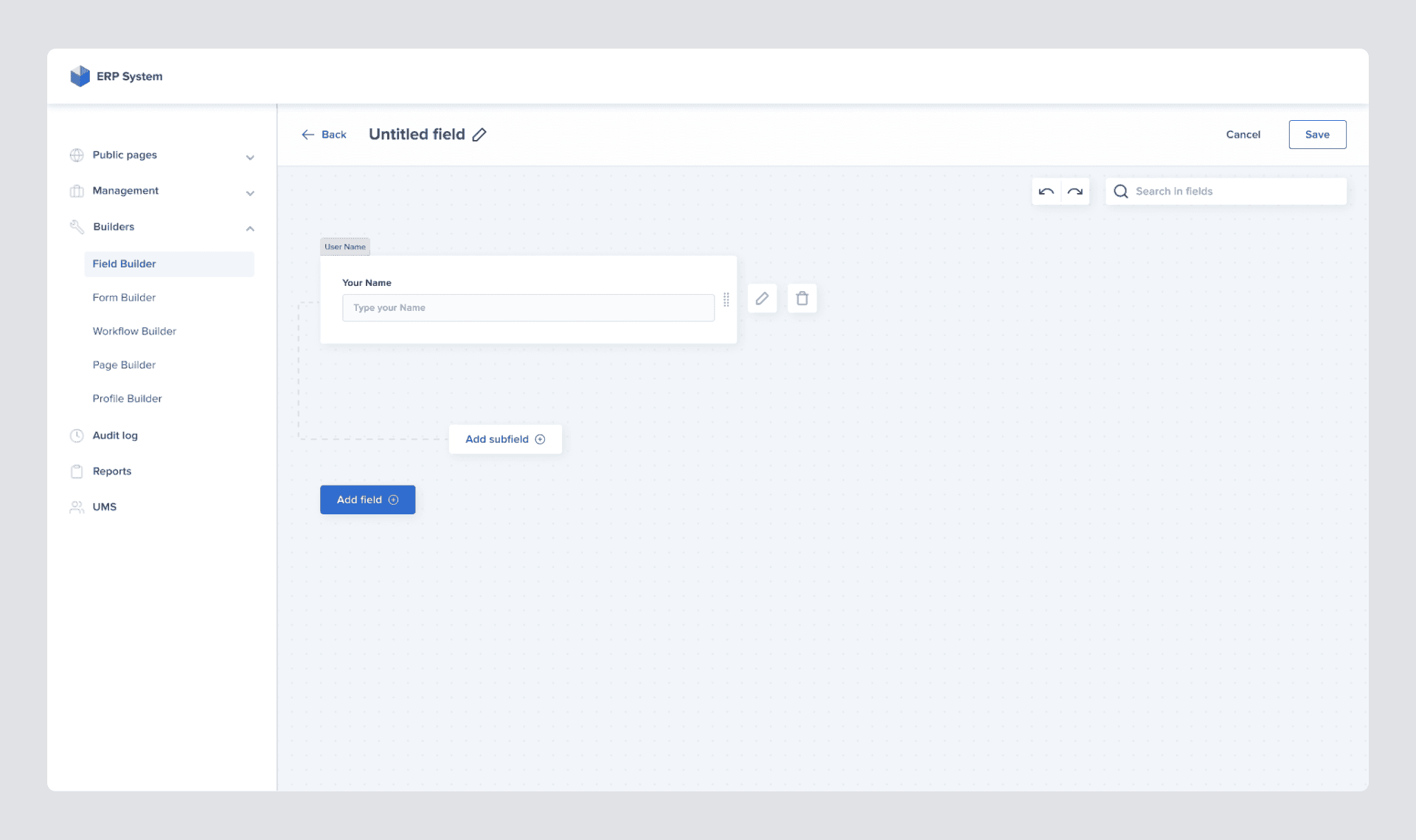
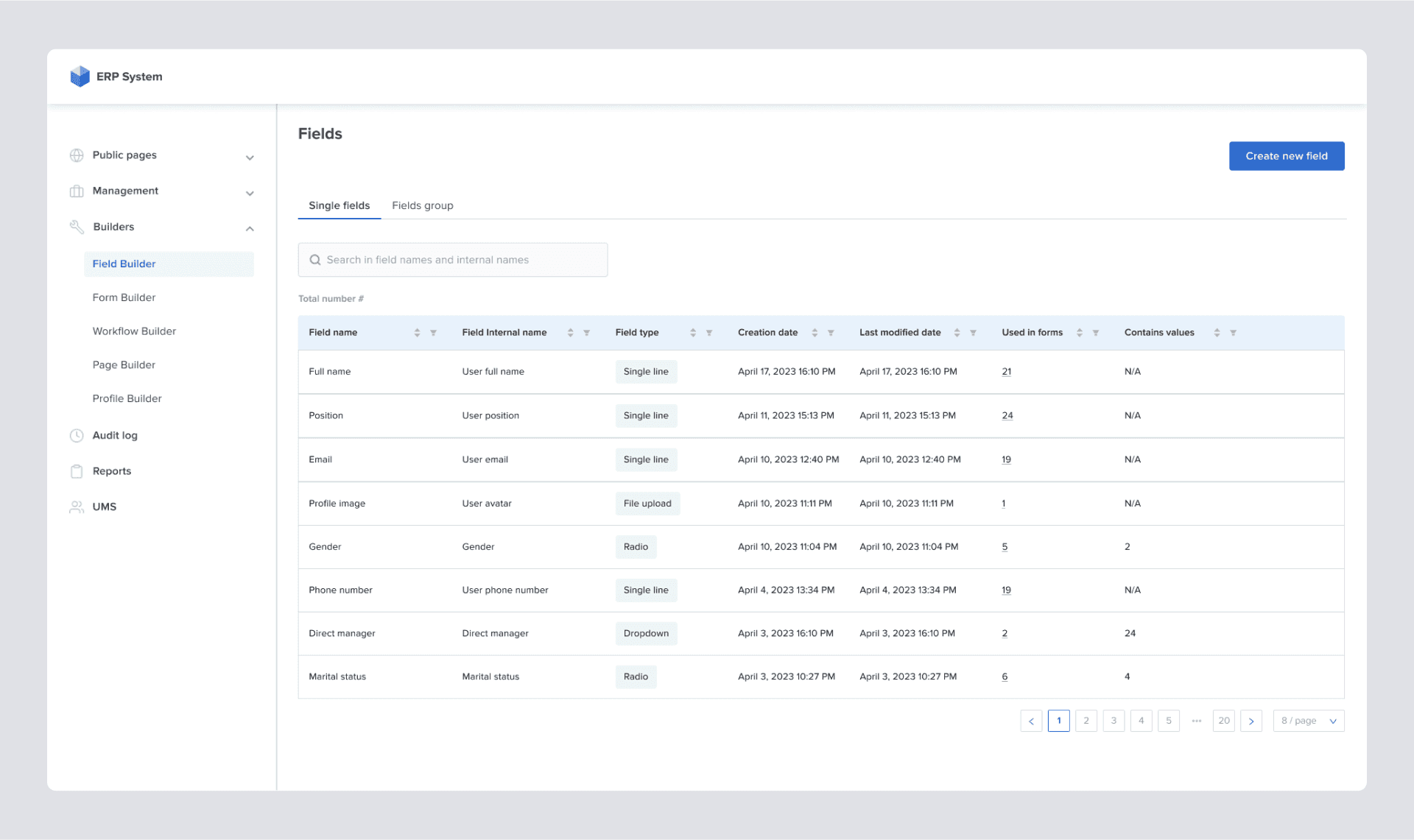
FIELD BUILDER
Field Builder consists of a page where a list of existing fields is displayed and the actual workspace where the fields are created. It was decided to visually represent the existing fields in the mainframe as a data table.
Using tables is the best way to arrange hard-to-understand information in enterprise software design.
A well-thought and designed interaction on the table can greatly improve clarity, simplify the user experience, and optimize data utilization. However, some crucial factors should be considered when designing a table. To name a few:
- What's the primary purpose of the data table for the user? How should its data be used?
- What devices will be used to view the table?
- What are the available interactions for the user?
All this should be clearly described in the PRD, as it's a matter of product manager's research.
After reading the PRD, we see that the Field Builder page is basically the place that contains all the existing fields in the system. In addition, it shows metadata per field tailored to the product users' business interests.
The wireframe we come up with looks like this:
After reading the PRD, we see that the Field Builder page is basically the place that contains all the existing fields in the system. In addition, it shows metadata per field tailored to the product users' business interests.
The wireframe we come up with looks like this:
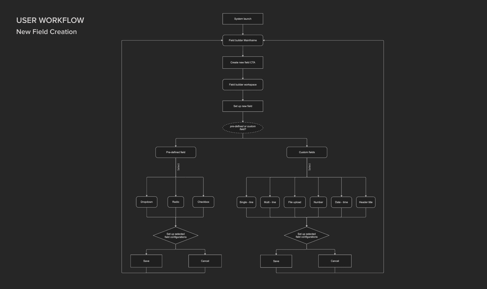
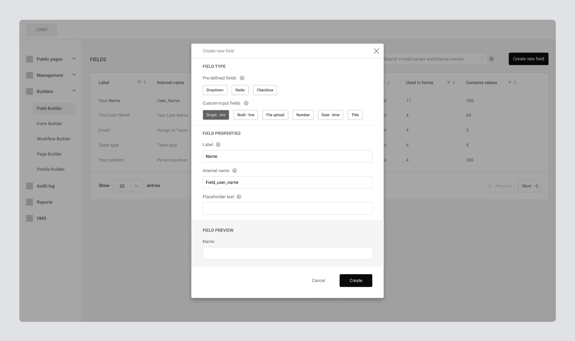
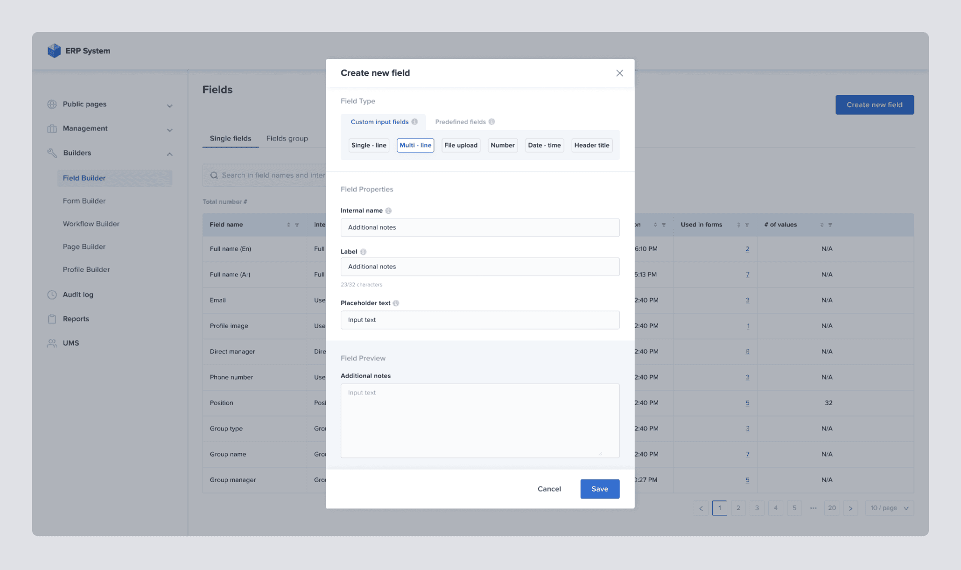
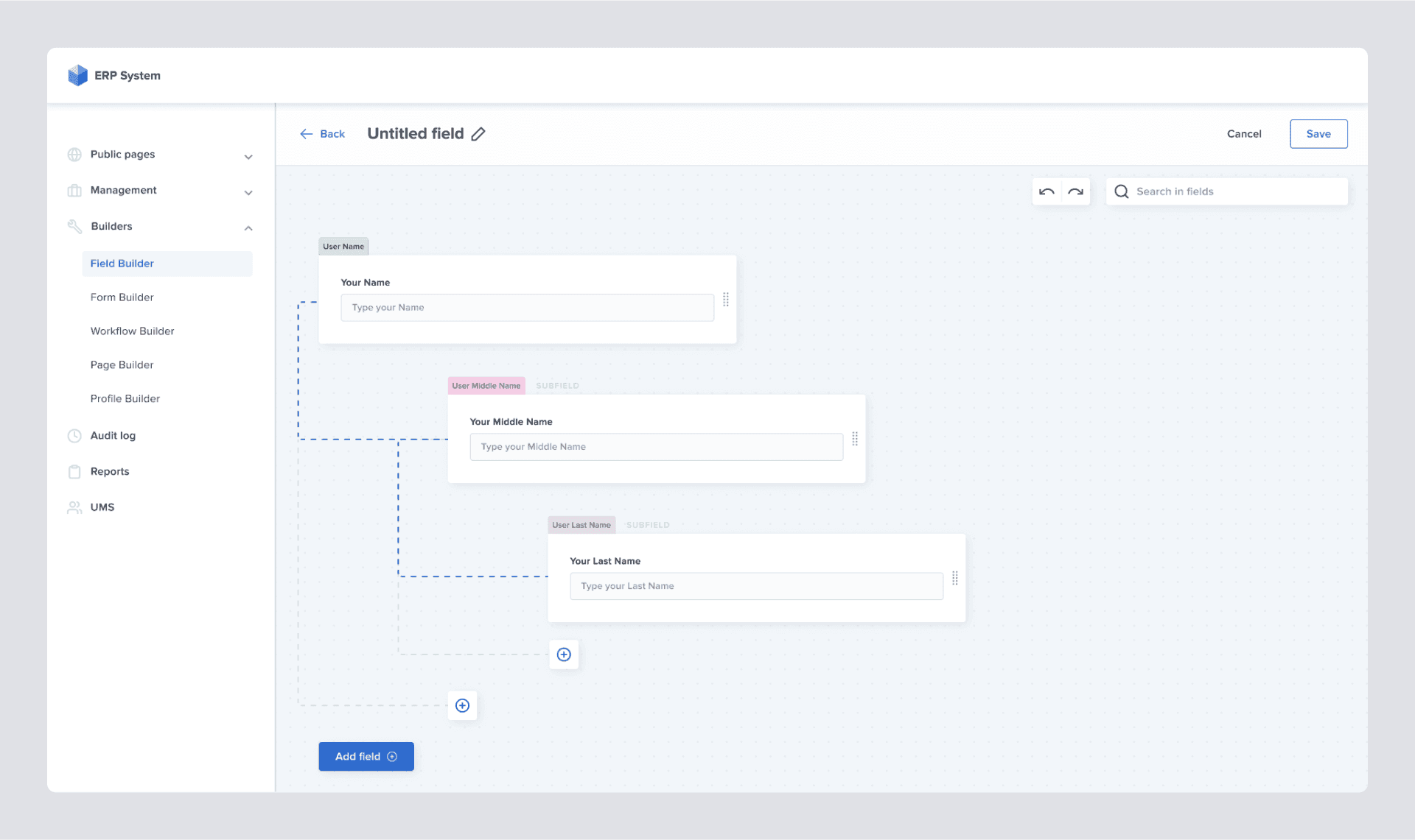
NEW FIELD CREATION WORKFLOW
Now we’re getting to the new field creation workflow. In short, from the PRD, we see that the builder should have the following main features:
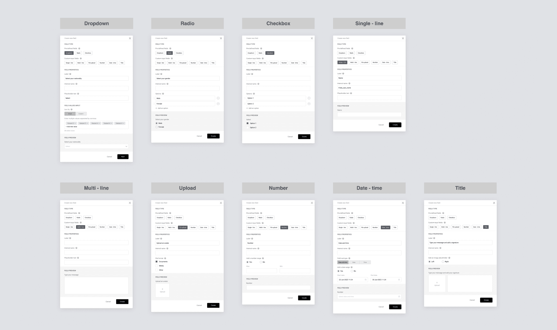
1. Ability to create custom and predefined nine types of fields;
2. Ability to edit configurations for each;
3. Ability to preview field before saving.
2. Ability to edit configurations for each;
3. Ability to preview field before saving.
One of the first questions was whether we should dedicate a separate page to the workspace or use a modal window.
The main argument for using a separate page was to ensure it is scalable. We've conducted multiple meetings with customers to understand how much scalability we should ensure in terms of a place for future features.
Finally, we agreed that we could cover pretty much all types of features for the next couple of years while keeping everything in a modal window.
Some other arguments in favor of having a modal window were:
- Modal windows can provide a more seamless user experience as they eliminate the need for users to navigate away from the current page. Thus, this will reduce the cognitive load on the user;
- A separate page might look too overwhelming;
- For MVP, the modal window-based solution works just fine.
#7. UI design and prototype
Now we have wireframes and low-fidelity prototypes ready. What we want to achieve next is the finalization of the UI design and prototype.
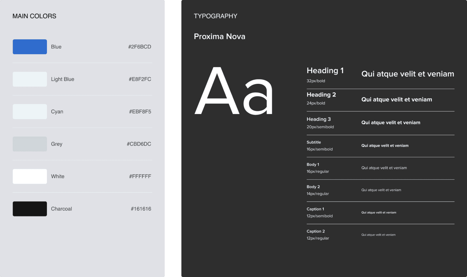
While considering various color palettes, we were picking from the most neutral ones. This was because users will be using the product for extended periods, and we wanted to avoid a situation where our interface is an eyesore to the user.
We’ve opted for muted, clean, simple colors and visuals to ensure a comfortable, easy-on-the-eyes experience. The corners of the visual elements are slightly rounded to make the interface look friendly. The font is Proxima Nova, a well-designed and versatile font that balances readability, aesthetics, and cleanliness.
#8. Design iteration
The design process is always continuous and cyclic. Digital experience is a living project that you should regularly tweak and improve. This is achieved by prototyping, testing with users, and in-house DEMOs with colleagues. These steps are repeated again and again until the best result is achieved.
Although we spent months working on the project, we paused to think once more just before handover to the engineering team.
Although we spent months working on the project, we paused to think once more just before handover to the engineering team.

The idea of the pause was to "zoom out" from so many details that we worked at and identify other areas that needed to be adjusted. These are the things that we've come up with at this stage:
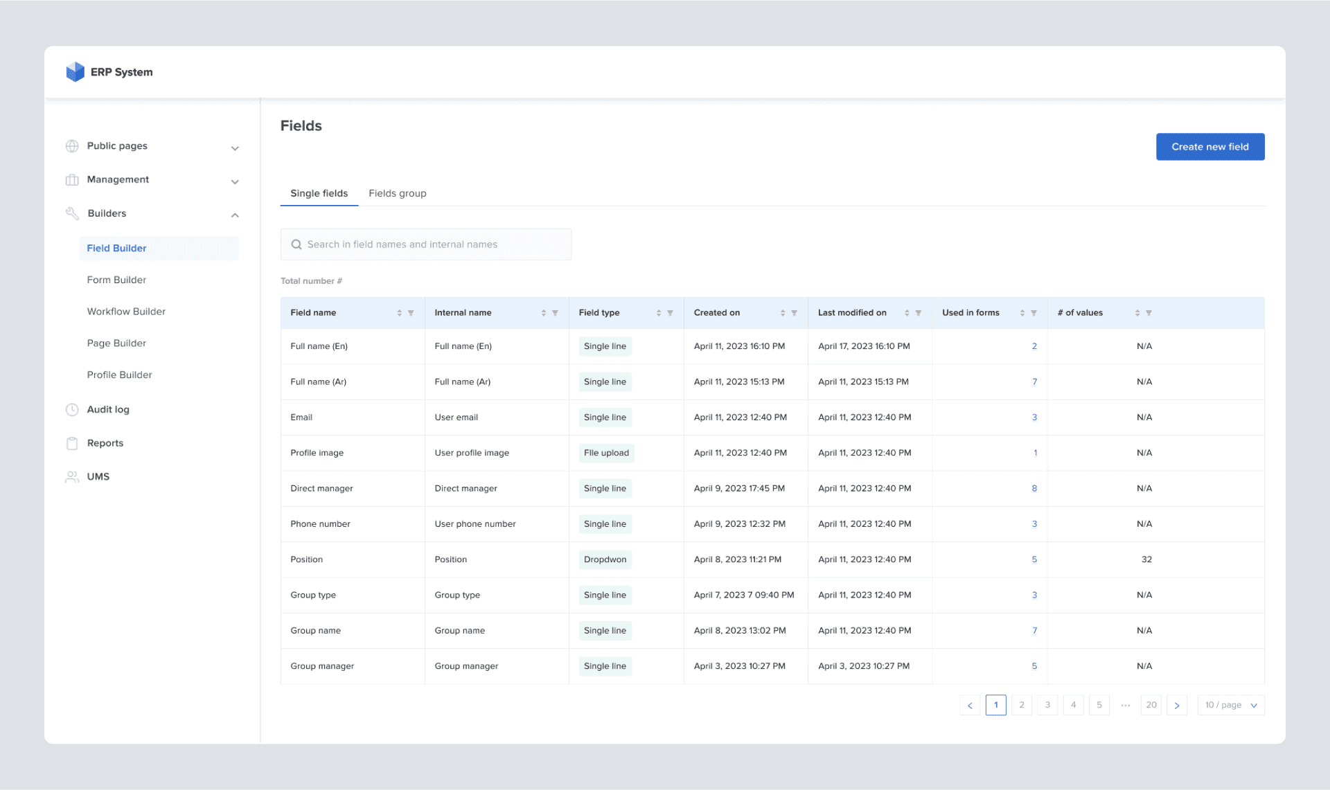
DATA TABLE REFINEMENTS
- Content alignment.
Whether textual or numerical data, the way it is represented in the table differs. The numerical data in our data table was left-aligned, which was not helping with readability, so we re-aligned it right. The data and multiple pieces of research show that when numeric values are right-aligned, it is much easier to compare them. This comes with exceptions. For instance, those can be left aligned when talking about qualitative numbers such as date, phone, and postal code. - Avoid duplication in naming.
We have spotted and removed duplicated words in some of the columns to alleviate the overall noise on the table.
FIELD BUILDER REFINEMENT
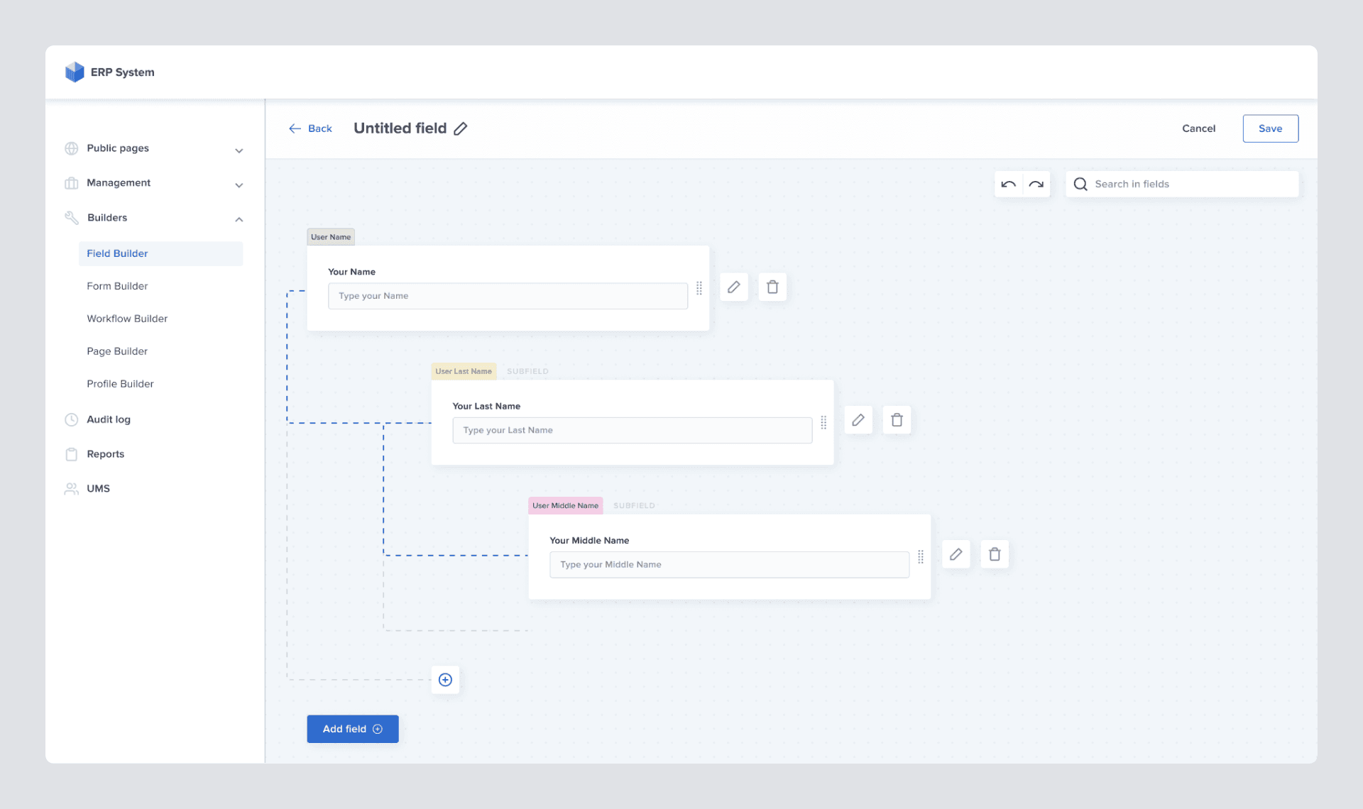
After one of the late rounds of solution validation with customers, we've been faced with a need to implement the idea of fields hierarchy and field group that initially didn't exist. To integrate these new concepts, we restructured the workspace. It has become obvious that we must abandon our idea of having a "modal window" and add a page step in the workflow.
We have used an exciting concept that I read in the book “About Face: The Essentials of Interaction Design” by Alan Cooper about different postures of digital products:
“Programs that monopolize users’ attention for long periods of time are sovereign posture applications. Sovereign applications offer a large set of related functions and features, and users tend to keep them up and “running continuously, occupying the full screen.”
Since we already know that our product users will regularly interact with the system and stay in it for a long time, the Field Builder feature fits into the “sovereign posture” concept, so we shouldn’t limit the space the system consumes.
So we've updated the design based on Field Builder's overall stance reconsideration and new product requirements: "ability to create field groups and set relationship between them".
So we've updated the design based on Field Builder's overall stance reconsideration and new product requirements: "ability to create field groups and set relationship between them".
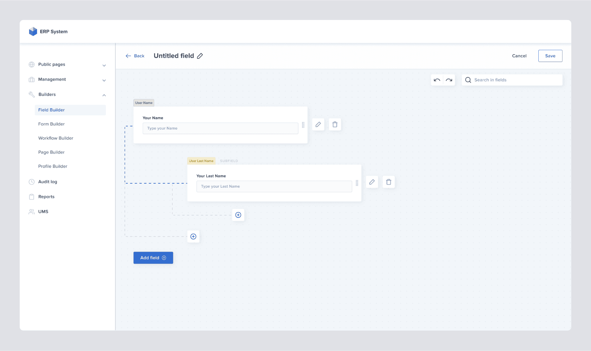
For the relationship setting between the fields, we've heavily relied on the visual representation of that relationship. We have decided to use drag and drop functionality, as such interaction with objects is the most self-explanatory way for our goal because they mimic physical actions like moving hard copy files on a desk.
Drag and drop functionality also makes it simple to rearrange already existing connections, so this was a no-brainer deal for us.
Drag and drop functionality also makes it simple to rearrange already existing connections, so this was a no-brainer deal for us.
#9. USER TESTING
As a final step in the design process, user testing was conducted to validate the experience and usability of the whole field creation and editing workflows.
Although we have constantly been working with customers to validate major milestones, we've now prepared a fully-functional prototype consisting of more than 400 screens in Figma.
During the demo, it has become evident that the parent-child relationship between fields is not obvious. We lacked a visual clue to clarify which fields were subordinate and which were superior. As a solution, a small indicator has been added to the fields to communicate their status better and not to violate the law of "Visibility of system status". This change helped users quickly understand a field's current state, and that was pretty much the last piece of feedback we processed.
Thank you,
Wolf Alexanyan and Kristina Shanoyan