
#8. How to write user stories
In this article, we'll examine Story writing, including detail level and considerations. As stated in a previous article, a Story captures the component's (feature's) requirements. Ideally, it is being written by the Product Owner. Still, when the feature requires professional knowledge, PO might ask appropriate experts for help (e.g., when the feature requires some specific knowledge about banking operations).
User Story writing
"User Story" is so-named because it's usually written in the first person, from a hypothetical user's perspective, outlining the features they'd like to see. It's usually made from a finished design.
"User Story" is so-named because it's usually written in the first person, from a hypothetical user's perspective, outlining the features they'd like to see. It's usually made from a finished design.
Let's say you, and I are on the same team. I'm a Product Owner, and you're an experienced Business Analyst. Our client is an online digital publishing platform called "JPUB". They work with our software development company, and from time to time, they request new features.
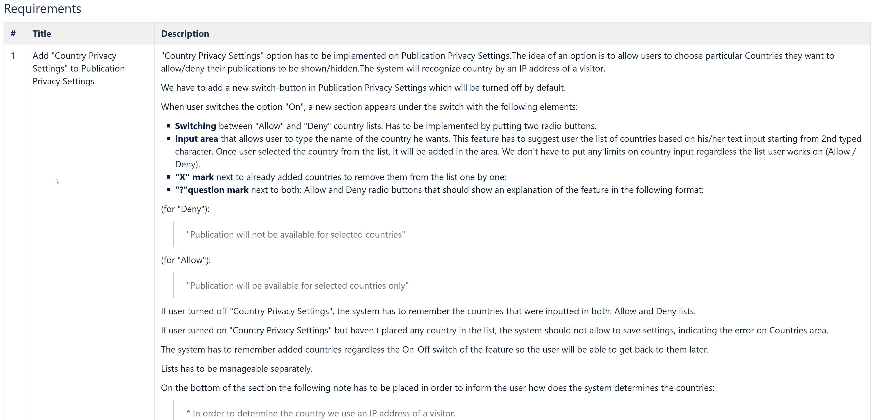
Today they have requested a new feature: the users of their website (publishers) should be able to limit access to their magazines by country. The feature is required ASAP. The deadline is set for the day after tomorrow. You are asking me to sketch an initial look at that feature.
3, 2, 1...
Today they have requested a new feature: the users of their website (publishers) should be able to limit access to their magazines by country. The feature is required ASAP. The deadline is set for the day after tomorrow. You are asking me to sketch an initial look at that feature.
3, 2, 1...
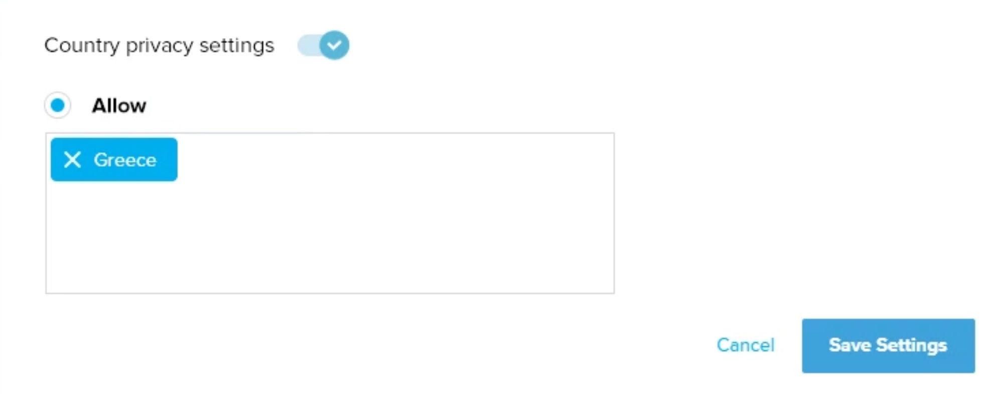
"Right, my sketch shows publishers can activate access restrictions by country and specify the countries that are allowed. You ask why not add the ability to block countries too, which makes sense as it's easier to limit access than to allow it for a lot of countries. I'm giving thought about what you said and adding the "Deny" option too."
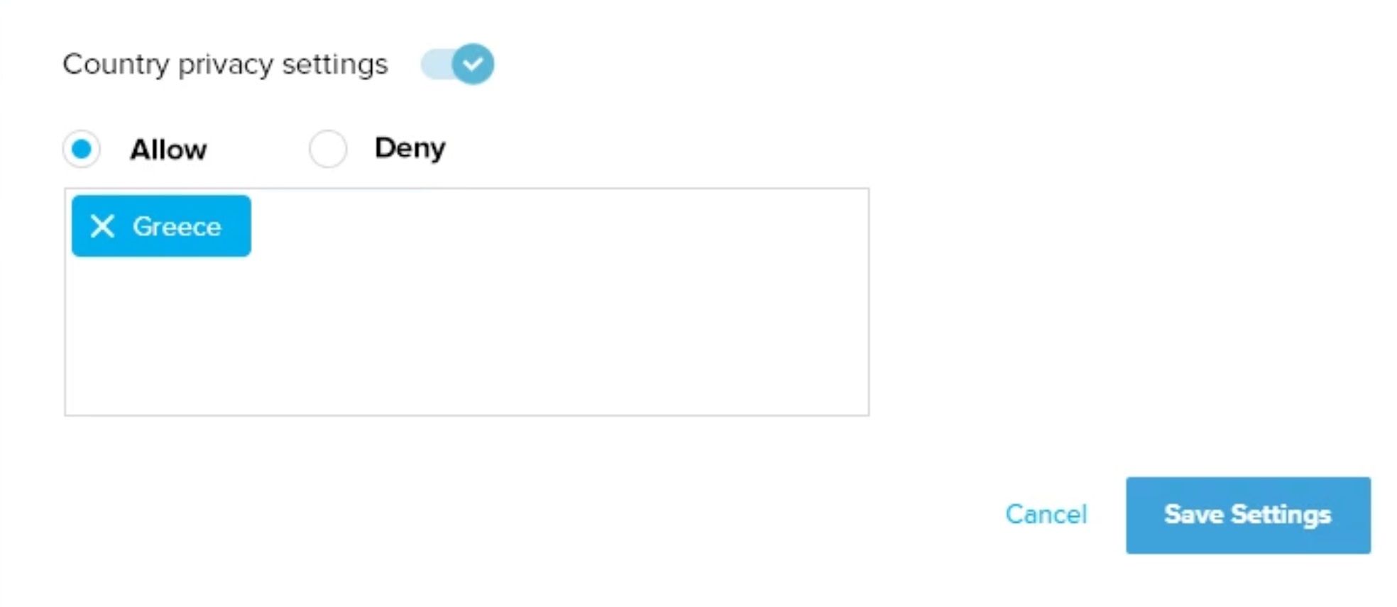
I return to you with the updated version and explain that the publisher can select either Allow or Deny, only one of which can be active at a time. You ask if we can guarantee no access to the countries on the list, to which I have to admit, "No, since we use the IP address to restrict access, someone using a VPN or other technology to hide the IP address may still gain access." You respond rationally: "Shouldn't we explain the limits of this feature to the publisher? Otherwise, they could complain a visitor accessed their publication, even though they were blocked."
And again, I return to my sketch and add appropriate notes.
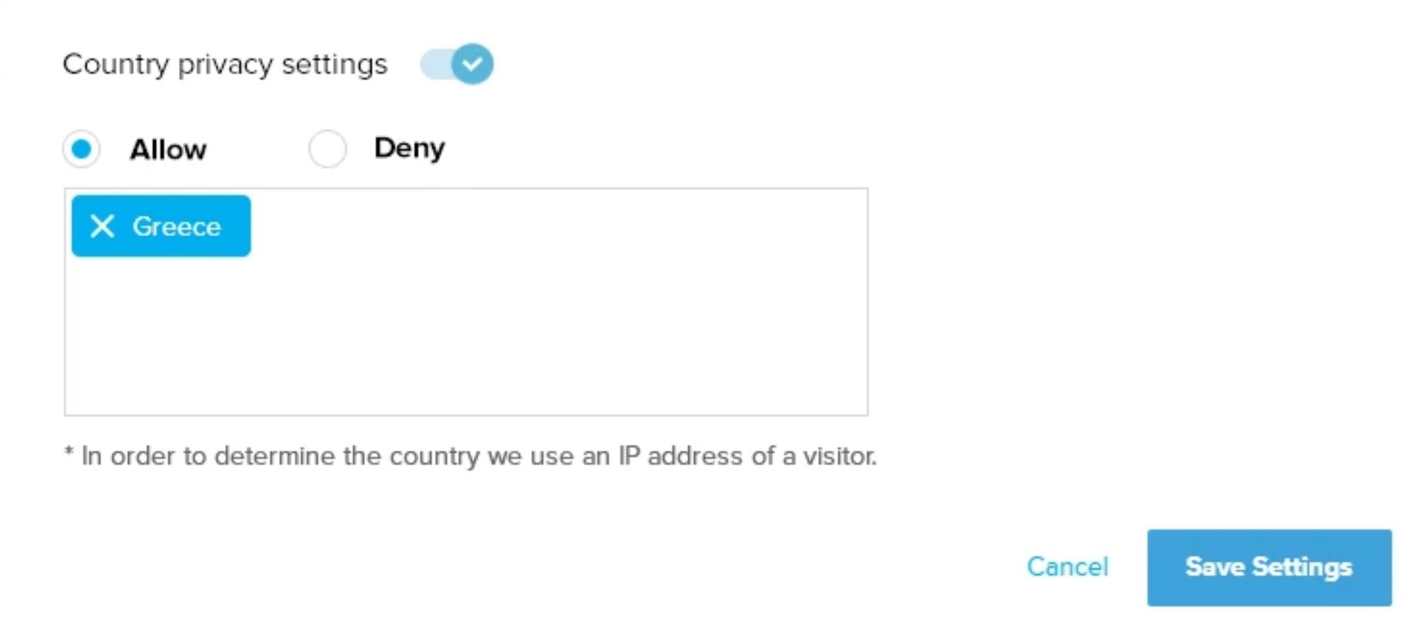
Fearful of appearing foolish, I take a closer look at the JPUB license, which gives buyers of online magazines unlimited access to their purchases. So I realize that if we implement this restriction function as I have drafted it above, readers with purchased magazines could find themselves blocked from what they paid for. To avert a potential dilemma, I add an extra note to my mockup.
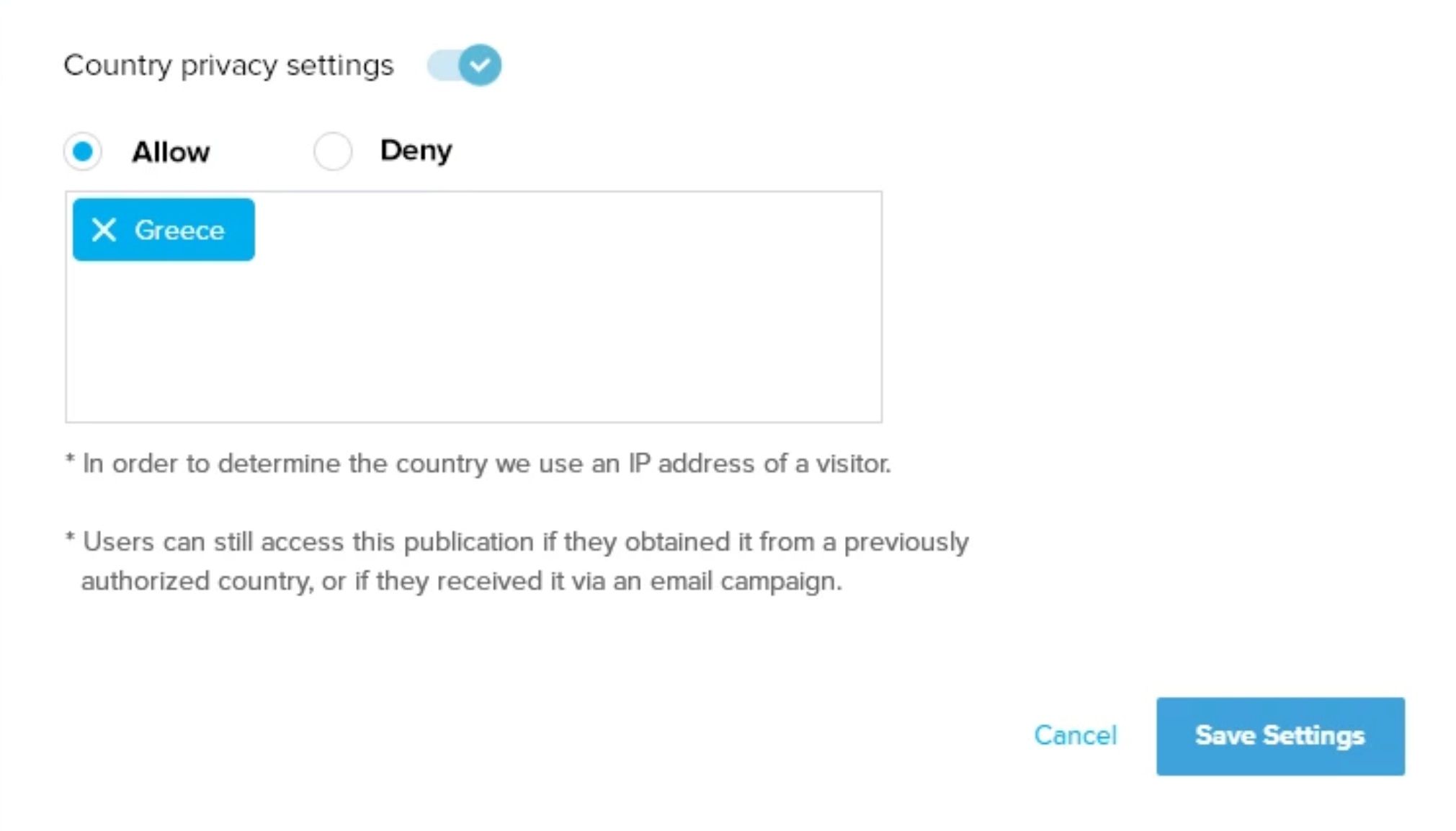
I return to you with a detailed explanation of my work. You commend me, "Well done, looks like it's sorted now," but on your way out, you mention a possible addition: "Maybe add descriptions of 'Allow' and 'Deny' for users with limited English." I take your advice and ask the designer to add a tooltip icon next to each option.
I have a design I'm confident in; the only thing left to do is change the color. Everything else is in order. On my laptop, I open our project management tool (say, JIRA). Then I create a new Story and put it at the top of the Product Backlog (because we need it ready by the day after tomorrow).
Now I'll write a short User Story similar to how it actually was written in JIRA.
User Story name: "Access restriction by countries."
User Story content:
User Story content:
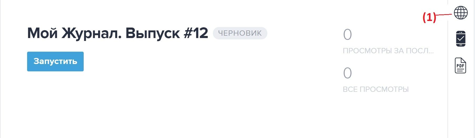
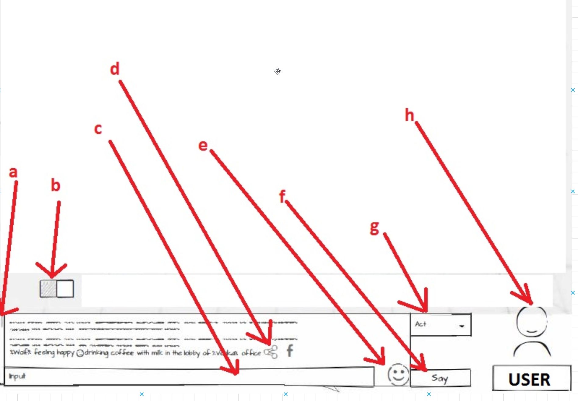
"As a publisher on the JPUB platform, on the "Publication management" page, I want to see a globe icon click on, which should open a pop-up where I can manage restrictions to my publication by country.
In this pop-up, I want to see a switch that will let me enable access restriction by country. Once switched on, the "Allow" and "Deny" tabs should become active. The "Allow" tab should be active by default.
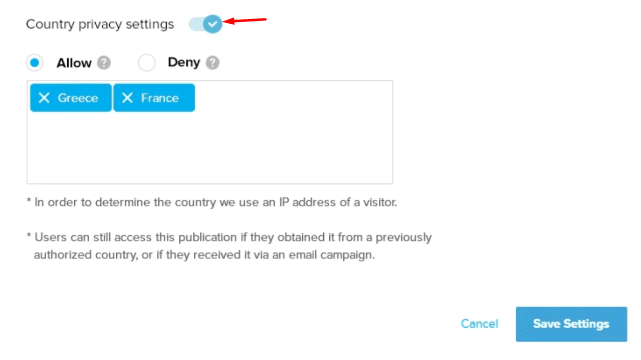
Next to the "Allow" and "Deny" tabs, the system should show question marks. Hovering on the question mark should open a help-text tooltip saying:
(For "Allow"): "Publication will be available only in specified countries"
(For "Deny"): "Publication will not be available in specified countries"
(For "Allow"): "Publication will be available only in specified countries"
(For "Deny"): "Publication will not be available in specified countries"
Both, Allow and Deny sections should have a multi-line text input area. When I click on it, I want the system to indicate that I have to input the country name. The system should have an autocomplete functionality, so I could see the list of the countries while I type.
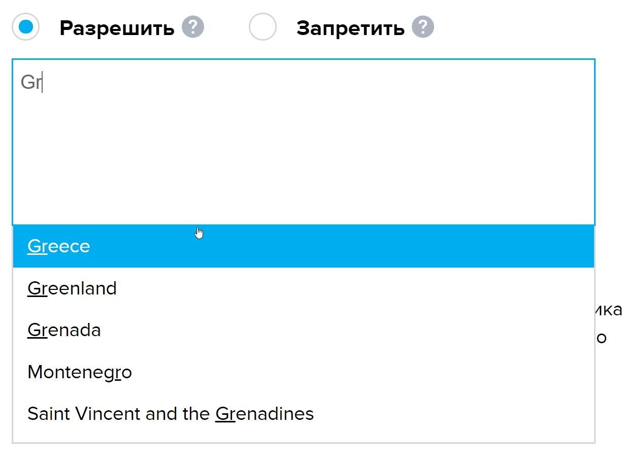
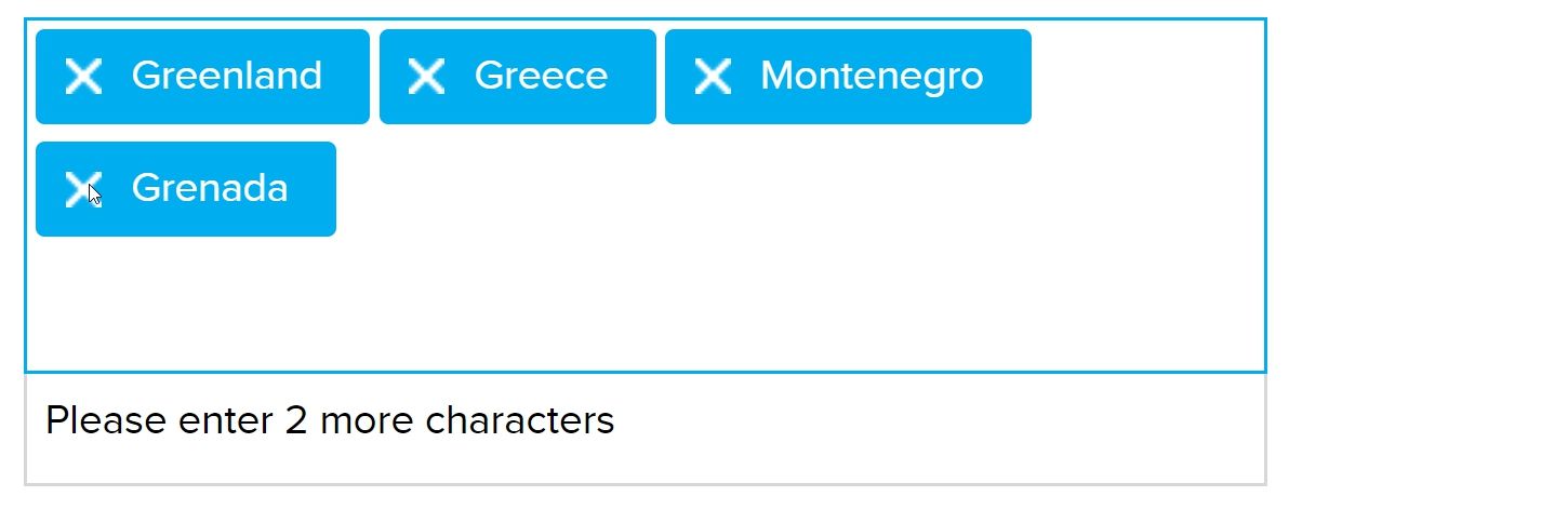
I want to be able to add an unlimited number of countries to any of the lists, and remove them from the list by clicking on the "X" in the country name or via the Backspace key with the selected input field. The system should inform me that the minimum of characters to be inputted into the field is two.
Once I configured the "Allow" tab and selected that tab as an option for country access management, the system should allow access to my publication only from the countries I wrote.
If I selected the "Deny" option, the system should restrict access to my publication for the countries I wrote.
If I selected the "Deny" option, the system should restrict access to my publication for the countries I wrote.
In the same pop-up, I want the system to show two notes:
"*We use the visitor's IP address to determine the country."
"Users can still access this publication if, at the time of purchase, the country was authorized or if they received a special offer by mail."
"*We use the visitor's IP address to determine the country."
"Users can still access this publication if, at the time of purchase, the country was authorized or if they received a special offer by mail."
The feature should become active once I clicked on the "Save Settings" button.
And that's all.
Now all I have to do is to wait for the next day, so once the UI-UX designer arrives at the office, I'll ask her to make designs for the user story, so we could pass it to the engineering team.
We did a great job of explaining the feature work. We outlined the buttons, texts, and switches with great accuracy. We have also taken into account the nuances of switching between lists, as well as the minimal number of characters needed to trigger the autocomplete feature. At first glance, it all seems to be in order. So developers may confidently start developing the features.
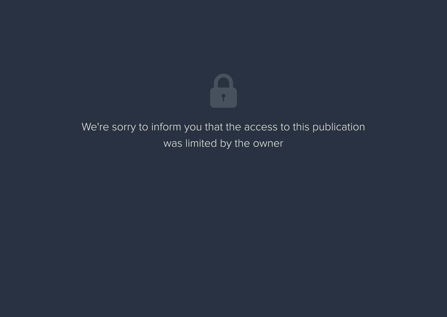
But even now, there is one more detail that we missed. What will happen if the user from the country for which a particular publication is restricted will try to open it? If we do not specify that, the look they might see could be something like this:
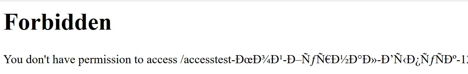
Obviously, not the most beautiful thing.
If the project was a personal blog, this error might be overlooked, yet our customer, JPUB, is a large online platform with millions of users. When a few platform publishers begin using this feature, a multitude of people, maybe even tens of thousands, who are attempting to access their desired magazine will be met with an unresponsive page. Obviously, this will have a negative effect on the project's reputation (the JPUB platform will take the hit, not the publishers).
If the project was a personal blog, this error might be overlooked, yet our customer, JPUB, is a large online platform with millions of users. When a few platform publishers begin using this feature, a multitude of people, maybe even tens of thousands, who are attempting to access their desired magazine will be met with an unresponsive page. Obviously, this will have a negative effect on the project's reputation (the JPUB platform will take the hit, not the publishers).
So, we must hurry to the designer and ask them to put everything aside and create designs for the missing access restriction page. This is then linked to the Story, and then we apologize to the developer for forgetting to include the page.
Now it's really done. The most important thing I want you to get from this article is to see how such a seemingly small Story became a big headache due to the carelessness of the Product Owner.
The attention and focus of the product owner should always be high, regardless of how seemingly small the developing feature is.
Although I skipped a lot of details in the story above, I do hope that the overall idea was understood.
User Story writing rules
1. The correct format of the Story is the one that is agreed with the Team. It can be a first-person narration; it can be a "text-picture" format, it can be anything: the only rule is that it has to suit the project team;
2. The correct detailing of the Story is one that is coordinated with the Team. The level of detail in the Story decreases in proportion to the time that the Team has been together. If the Team is new, there should be more detail in order to avoid misunderstandings;
2. The correct detailing of the Story is one that is coordinated with the Team. The level of detail in the Story decreases in proportion to the time that the Team has been together. If the Team is new, there should be more detail in order to avoid misunderstandings;
- The correct size of the Story is one that gives enough information to all team members working with the Story so that there are no unanswered questions.
User Story content rules
The art of writing Stories is to determine the minimum amount of information that will be sufficient for the Team to develop exactly what is needed.
The art of writing Stories is to determine the minimum amount of information that will be sufficient for the Team to develop exactly what is needed.
To do this, the Product Owner has a number of tools that they can safely use in Story (in agreement with the project team):
- Screenshots
- Screenshots with notes (like the ones we have already seen in this article)
- Screencasts (video)
- Sketches, Layouts, and Design files
- Presentation files (rarely)
In other words, pretty much anything.
The Product Owner should not limit themselves to a "single style" when compiling Stories because that wouldn't be flexible enough. If a team needs screenshots, then the PO makes them. If a team needs videos or sketches draped on stickers, then the PO creates them.
If it gives value while it looks ugly, it can also be used. Example:
Notes for the Product Owner
- If you want to do the job quickly, don't rush;
- If you're planning to stay in the office until late to finish something so that it is ready in the morning for the rest of the Team, forget it. Such plans rarely work. At the least, you should be prepared to check for urgent messages first thing in the morning;
- If you have already had to change the Story twice, and you're still not satisfied with it, then have a cup of tea, take a walk in the fresh air, return to the workplace, and go through it one more time;
- If you're checking the Story and you skip a few paragraphs "because everything is clear there, I've read it a hundred times," then have a cup of tea, take a walk in the fresh air, come back, and read those paragraphs again;
- If you find yourself quietly smiling as you read these notes, then yor gut feeling works great.
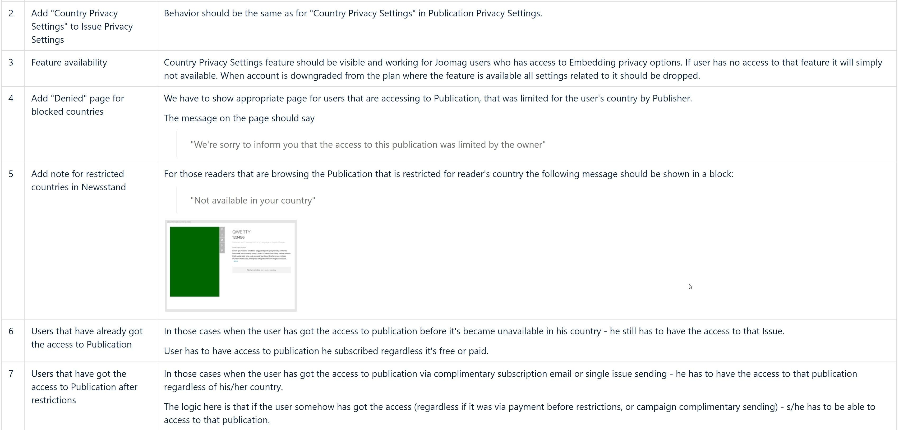
We've come to the end of this article, and I want to show you how the above "Story" was compiled by me in the PRD (Product Requirements Documentation) format in Joomag (some details were omitted):
So now we understand User Stories better.
In the next article, we will look at the technical components of the project.
In the next article, we will look at the technical components of the project.